Today one of my first year web students emailed me a question:
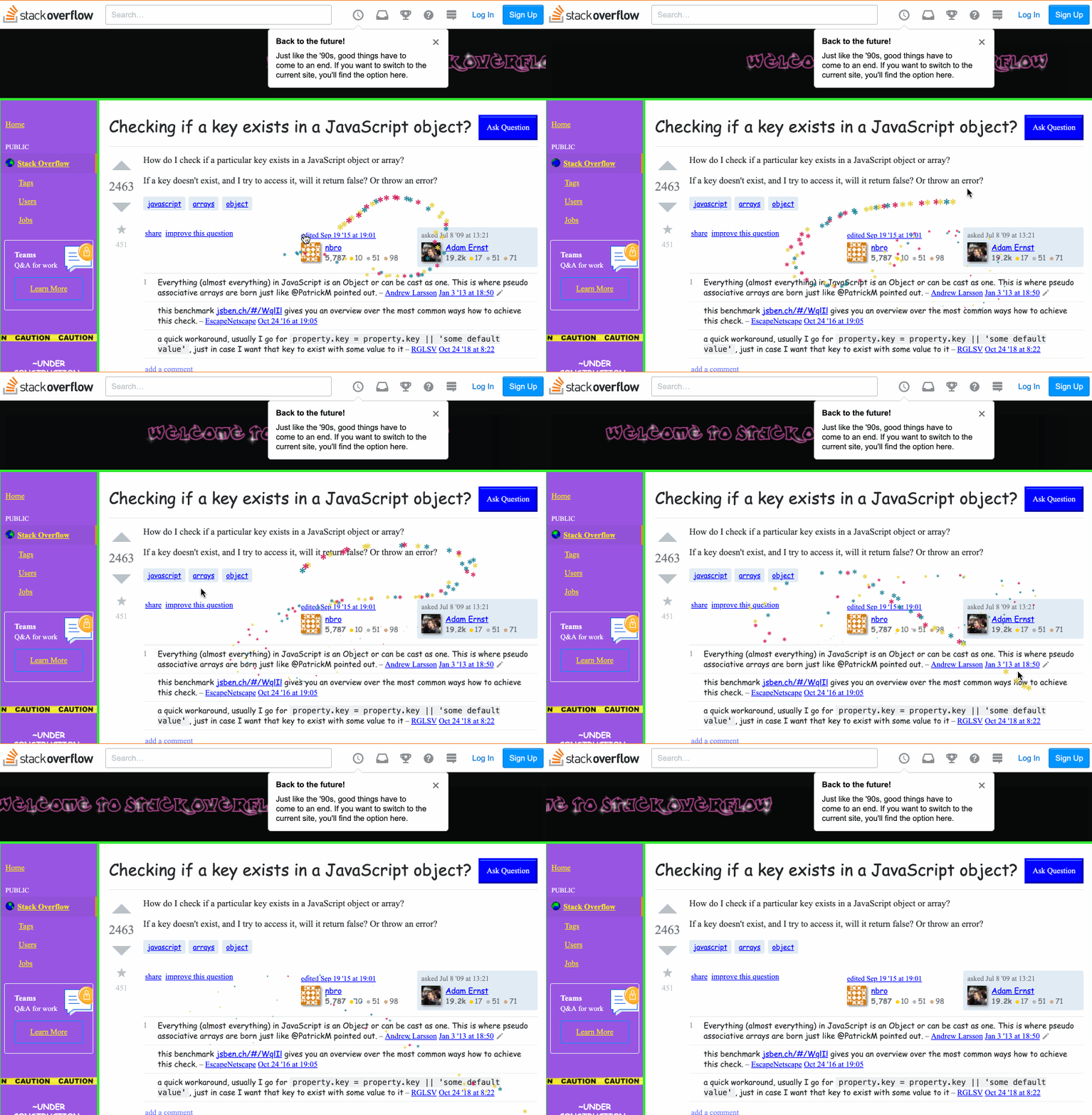
Today when I was searching some questions on StackOverflow, I found their website turns to a really interesting display and can be changed to the regular one back and forth by a button on the top. I guess it's some April Fool's day joke...how did they make the mouse pointer thing? There are stars dropping and tracking the pointer when you move it, I was thinking of inspecting it to get a sense, but then I realized I usually use the pointer to click on an element for inspecting, but I can't click the mouse itself, so I'm lost...Here's a website to explain what I'm saying: https://stackoverflow.com/questions/1098040/checking-if-a-key-exists-in-a-javascript-object?rq=1 Could you tell me how does that work, is this till done by CSS? or JS?
I went to look, and here is an animation of what I found. Notice the trail of stars behind my mouse pointer as it moves:

My first thought is that they must have a mousemove handler on the body. I opened the dev tools and looked through the registered event listeners for mousemove. Sure enough, there was one one registered on the document, and the code looked like this:
function onMouseMove(e) {
    cursor.x = e.clientX;
    cursor.y = e.clientY;

    addParticle(
           cursor.x,
           cursor.y,
           possibleColors[Math.floor(Math.random()*possibleColors.length)]
    );
}
Reading a bit further into the file revealed this comment:
/*!
 * Fairy Dust Cursor.js
 * - 90's cursors collection
 * -- https://github.com/tholman/90s-cursor-effects
 * -- https://codepen.io/tholman/full/jWmZxZ/
 */
This is using tholman's cursor-effects JS library, and specifically the fairyDustCursor.
This code is really fun to read, especially for my early web students. It's short, readable, not unnecessarily clever, and uses really common things in interesting ways. Almost everything it does, my students have seen before--they just might not have thought to put it all together into one package like this.
Essentially how it works is that Partcle objects are stored in an array, and each one gets added to the DOM as a <span>*</span> with a different colour, and CSS is used to move (translate) each away from an origin (the mouse pointer's x and y position). Over time (iterations of the requestAnimationFrame loop), each of these particles ages, and eventually dies, getting removed from the array and DOM.
As I read the code, something else struck me. Both Stack Overflow and the cursor-effects library talk about this style of web site being from the 90s. It's true, we didn't have the kind of refined and "delightful experiences" we take for granted today. It was a lot of flashing, banner adds, high contrast colours, and people inventing (often badly) as they went.
Yet reading the code for how this effect was done, I couldn't help but pause to reflect on how modern it is at the same time. Consider some of the browser APIs necessary to make this "90s" effect possible, and when they were first shipped (all dates are from caniuse.com):
querySelectorc. 2008 WebKittranslate3dc. 2009 WebKittouchstartevent c. 2009 GooglerequestAnimationFramec. 2010 Mozillapointer-events,touch-actionc. 2012 Microsoftwill-changec. 2014 Google
The progress that's been made on the web in the past 10 years is incredible. In 2019 it only takes a few lines of code to do the kind of creative things we struggled with in 1999. The web platform has evolved to something really great, and I love being part of it.